Monday, 11 April 2011

Final Evaluation

Its a bit late due to Ive been trying to comprehend what i actually think has gone good and bad with my project. The conventions of my trailer have come across to the target audience and the connotations have been seen by all. The characters represent their specific sex, race and personality which i am really pleased with. The genre is a little more the come to terms with. I was hoping for a general view of a action/ thriller view with a sub genre of urban feel to it. The use of some of the settings in London helped well with that also the backing track really set the mood and atmosphere.

My planning has been brilliant. From the very first day i knew what i was aiming at. I had the idea in my head and stuck to the path. This made it easier for me despite actually having to produce the shots. Luckily i have a natural flare to organise and see the shots before actually shooting it. Weather was sometimes a problem not allowing me to do what i wanted when i wanted. I also saw this wit a lot of other students their planning was very bad which then meant they struggled with for seeing what they were going to produce and what they actually wanted as a whole. This spurred my confidence.

My strengths were editing and filming itself. I blended everything in well to create a small but unsure narrative to get the audience wondering what is going to happen i also had this feed back. quote ' where is the actual film then, i want to see it' This put a smile on my face knowing that someone liked it enough to actually want to see it as a film. If i was to do anything different i think it would be the length i think with the genre the trailer itself could be a little longer to get across to the audience more of what my point is. With this genre its difficult to get the meaning across. Something like horror is really easy all you need is scary music and something bad happening with say the mise en scene.

The acting in my trailer was to a good standard. At times it was difficult because they couldn't do what i had in my head so i had to improvise. My blog had been a good check point for me. Keeping up with it has enabled me to see what point I'm up to and what Ive done at a previous stage to correct a problem eg. the sound track having to find rights of the sound. Even though i got really stressed about it, it came down to one day talking to a teacher and her saying the college has rites over copyright as long as if is not for a gain. As you may imagine this made me happy. My inspiration for this type of film were films such as crossover which is an American film, not a major blockbuster but something that really leaves its print in my head and the film freestyle which is a low budget British film that really gives you the feel of the gritty streets of London.

In conclusion i am very happy with what i have created, I'm happy with the overall trailer and the feedback i have received. The target audience was a success as well as everything else. My planning and determination was the key to this success.
Friday, 25 March 2011

Reflection

I have just been reading through my blog and have noticed how all the planning at the start totally changes. The poster and all the connotations such as the trainers guns and basketball hoop etc.. As the project evolves you find things can and cant work. This is weird to see that the idea in your mind can be very different to the view you had in the first place.

Evaluation of Magazine cover

In comparrison the the film poster this 'Film Icon' cover is very simple. The fact that my poster in my eyes was a little full in aspects of images etc.. i wanted to have a nice simple cover. The image of the character Hearts is the USP unique selling point of this magazine. It is what makes it bold and stands out. The masthead of the cover is used to frame the image that works very well. Again the use of colours are limited again. The reason for this is i want to get the point across to the audience that this film is dark. Its about betrayl, murder, violence. The effect wouldnt be seen if it had colours flying around everywhere. The picture being dark due to showing the target audience that hears is the antagonist in the film.

The sub headings are to draw the audience in to look at the film. This is done with behind the scenes interviews and the actual opinions of the cast. People like to read things like this, it gives the viewer a real insight to how the person playing that character thinks and feels. It also opens a whole new chance for viral marketing. All that is needed is a link to the internet that they have to go on to view everything about the film. I didnt put this into my magazine because i wanted to talk about this. The use of cross media convergence is astonishing. Viral marketing being a big factor to get people to go online and get word and mouth about the film and to recieve reviews etc.. But the fact that cross media convergence can get to a person by sending a text to someones phone and the trailer pop up right infront of them.

My opinion of this magazine cover is that it blend. Now that can be seen as a good point or a bad point. The good point meaning it gives the page a sense of flow, that the theme is set and fits well. But opposing that can be that you cant really tell alot about why that person is on the front, why is it dull etc..

Evaluation of poster.

My aim was to catch the eye of my target audience this is teenagers from the age or 14 to 19. The colours tend to be a little bland. This is done on purpose. I used the black and white effect on the picture to give a sense of disturbance. Two obvious connotations White - Good and Black - Bad. I think this comes across well even though you may have to look deep to find the meaning. The use of the orange text symbolises 'jail'. A normal connotation of jail is the orange overalls. This contrasts very well with the black and white backing picture. The gunshots are a hint to whats in the film itself. Does someone get shot ? only way to find out is to watch it. The fact that there are two bullet holes with blood also gives the audience leeway into thinking that it may be more than the one person getting shot.

The teenagers are older teenagers. Hearts being 19 and Danny being 18 and Eliza 18. They are represented well by there mise en scene. Especially the two main, Danny and Hearts. The hoodies a stereotypical view of teenagers. You can tell by how there body language is to where they live, Urban areas. Eliza on the other hand is from a total different background. She gives the view of a blue collar working class girl. The mise en scene gives meaning to this with how her attitude is and how she dresses. Meaning is given that she is lost in a total different world, a high class girl in a dog eat dog urban environment.

The genre can also be seen from the trailer. Mostly by the characters than the scenery. The characters look show that they don't look to happy or nice. their dress sense doesn't seem to be what could be classed as a normal look. The big factor is the body language. Both in a position that looks as if they are confronting something or even someone. The genre of this film is thriller/action (urban). The narrative is quite simple. Danny is grieving due to the loss of him mother and his sister. He knows who did it and how, he seeks revenge but first plays games. He outsmarts Hearts and gets in to Hearts inner circle. Then manages to deceive and disrupt everything with Hearts 'so called mates'.

The problem with the poster is that i wanted to keep it full ready to burst with images clues about the film. The problem being if you put to much in it makes it look really bad unless its done correctly. I usually take i keen eye towards simple posters and like them more, so it was more challenging myself and my own likes and dislikes to others opinions.

Monday, 14 March 2011

Final cut pro explination


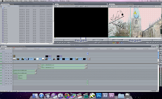
This is a typical Final Cut screen as you edit. This was taken quite some time befor i finished hence why there isnt many insercians. It can be quite difficult to comprehend with the programme but althought it can make your really angry at times, it is without a doubt a brilliant piece of software.


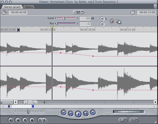
Through out editing the amount of times i have seen this, or say had to make a difference in the time line is stupid. It plays a very important role in the trailer it can be for anything, audio, text, pictures and of corse the clips themself. You can alter what happens in a timeline by putting key frames (the small dots) to select the ares that you want to differ. This can do things such as alter sound, change sizes of images and much more.


Out of the 60 odd clips i recorded in the end after seeing if eacvh would fit i only ended up with aroun 6-10. That make it seem such a hastle to go through all that just for the amount you will get. But dont be to quick in thinking that because it isnt true. the clips you dont use can be inserted if you have any problems. I know i had to do it at least once in my trailer. The programme shows a ver inication to every clip or file. I started off not liking the programme but now i cant get enough of it.

Again as i said earlier you can see vaguely that i have altered the timeline to change the text on screen. This text appears from nothing and then gets to a certain size then dissapears again. alot it allows you to change the font of the text, colour, alignement and much more. That is even without effects added !
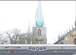
This is the start sceen of my trailer. Im now just
trying to do something with my Slight Tilt logo but it is prooving to be quite hard as it seems to go to a bad blur. But again i hope to sort this out asap.
I have uploaded these screen shots of Final cut pro to show some of the basics you need to be able to master to get a good editing technique. I am getting to the stage where i can tell what will and wont happen and if so what i need to do to sort the problem out. Also im getting good at finding loop holes into situations that occure with the software. This programme has been a challenge but now seems interesting and i am happy to use it when i get the chance. The amount of different things you can do with it is boundless. Each time i have been on it i have learnt a lot of new and interesting things to do.

Sunday, 13 March 2011

Slight Tilt

You will probably be aware that when u watch the trailer the Slight Tilt Logo has changed. The reason for the change is that it was impossible to transfer the actual logo over to editing ad do what i want to do with it. It would of spoiled the overall trailer in my opinion. So i used Photoshop Express to make a logo. It is however being difficult to still do what I'm wanting to do. But hopefully this is a hurdle i will get over quickly.

Saturday, 12 March 2011

Titles

Filmed by ; Kieren Smith
Edited by ; Kieren Smith
Danny ; Peter Horrell
Eliza ; Cara Scordelis
Hearts ; N/A did'nt want his name showing so he used mine. (Kieren Smith)

All people that were in the background had signed that they were willing to be in the filming i will show proof of this with pictures i upload of my editing and other information on Monday.