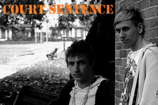
It is taking me a lot of time to learn how to use the functions on Photoshop sometimes it will do what i want to do and other it wont. I'm trying to play with the effect of a blur. I want to try to keep with a grey style effect with the colours of orange (representing prison outfit colours) and different tones with the awards etc..
This is the basic back layer
(was a wide shot but i zoomed into the picture and centralised myself and altered the contract, colour and brightness.)
I then took the picture of Peter and cropped it down and placed it to the right of me. I tried to blend the edge of the wall in with the picture. It wasn't actually a corner of a wall but i managed to make it look as if it was.
(Notice that Peters picture may be black and white, but his picture is lighter than mine. for a reason a hint to who is the protagonist and the antagonist.)

(with the title just a stage after)
After a while i ended up playing and altering text within the poster and a short synopsis. It took me ages to sort it out but i had finally finished and it turned out as below. I understand it may be seen as jam packed but that's how i wanted it to look, to represent the hustle and bustle of city life.
This is how the poster has ended up. I'm happy with how it looks i have got what i need on it with all the information needed for the audience to know what is what. I have purposely left the date of coming out out because i want the audience get anxious to find out when.


No comments:
Post a Comment